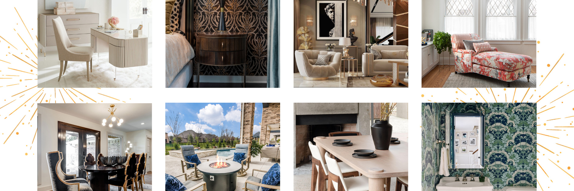
Color is often overlooked as having an impact on our mood and the way we feel in each room of our home. With interior design, both color and lighting are critical elements to making not only a visual difference but a psychological one as well. Light and color can do all sorts of things working together in a room. Balancing the right lighting with the right color palette can make a room look larger, more intimate, warm, cool, exciting, and relaxing.
How Color Works
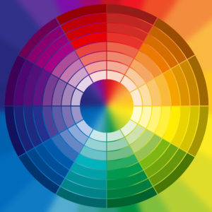
Interior designers often use a color wheel as a guide when designing rooms. There are different types of color combinations that they often follow:
Complementary: Colors that are opposite of each other on the color wheel that are best used as accent colors.
Triads: Colors that form an equilateral triangle on the color wheel that are best used as balanced accent colors.
Analogous: Colors that are next to each other on the color wheel.
Monochromatic: One color that is different shades, tints, and tones.
The color wheel splits the colors based on warm or cool colors that affect how space is perceived. Cool colors create the illusion of spacious and formal while warm colors create intimacy and closeness. The colors not included in the color wheel are white, black, beige, brown, grey, etc. still play a critical wheel in interior design as they are often used as the dominant colors.
The 60:30:10 Rule
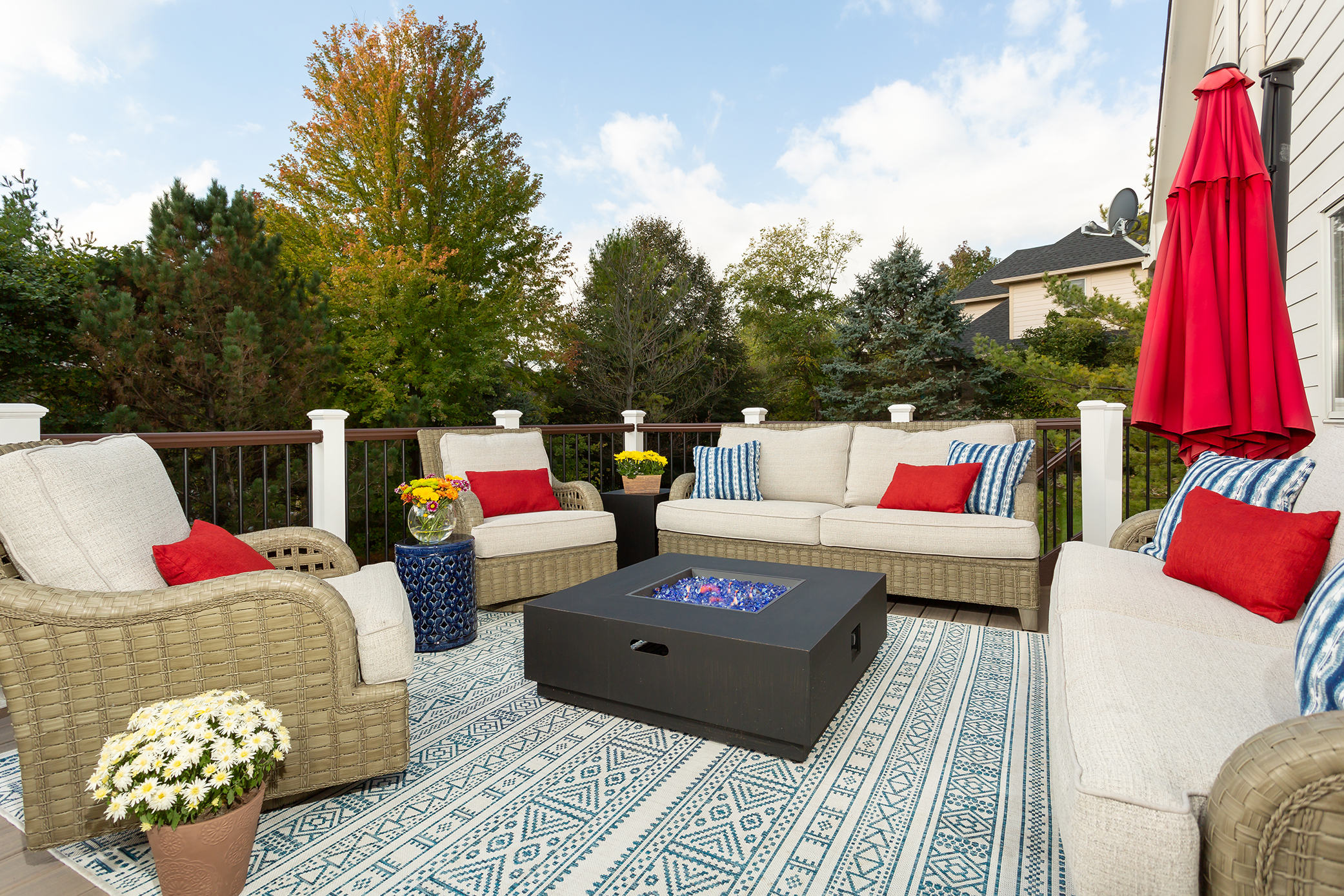
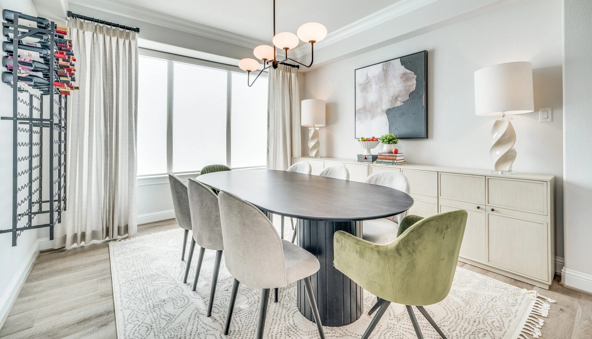
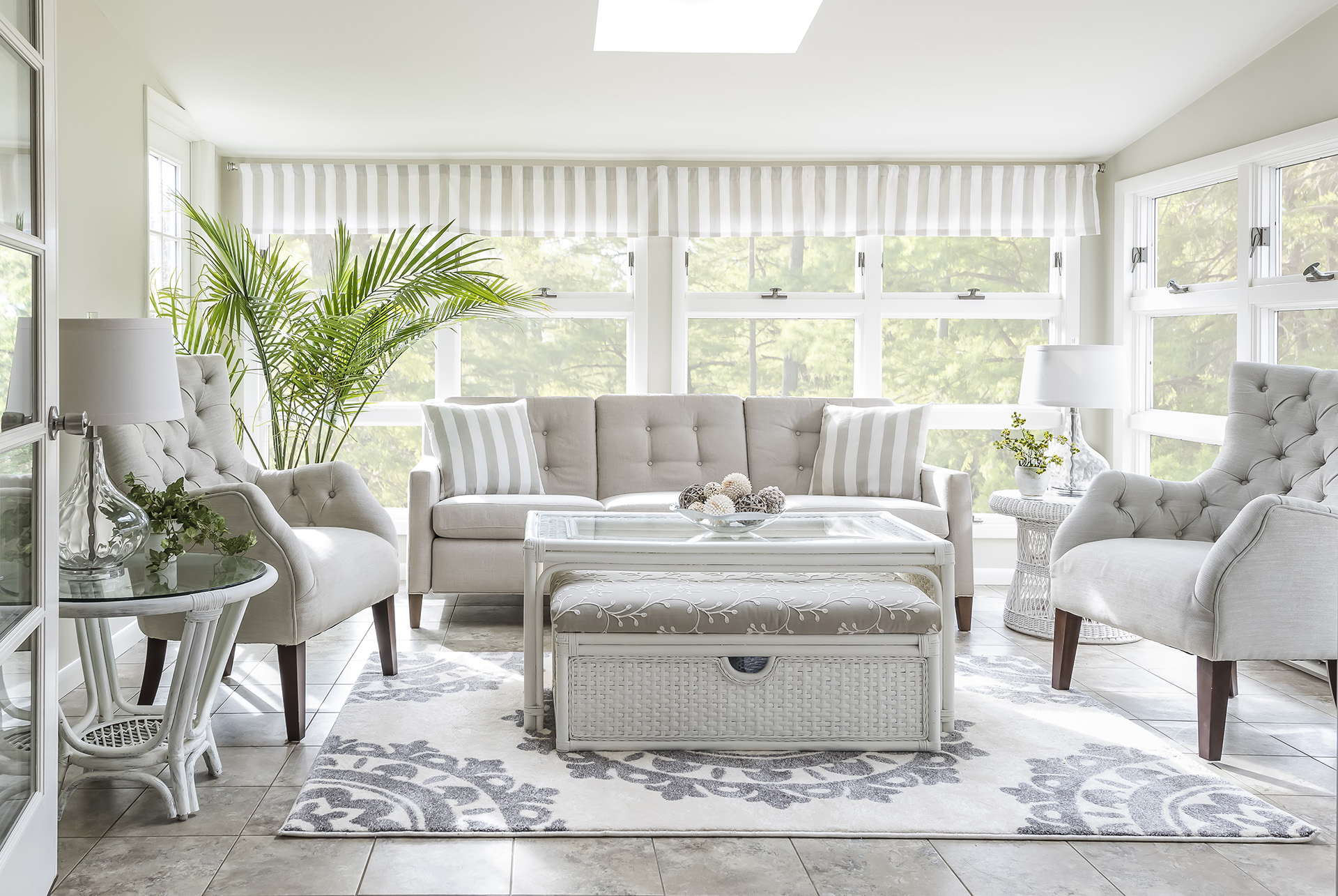
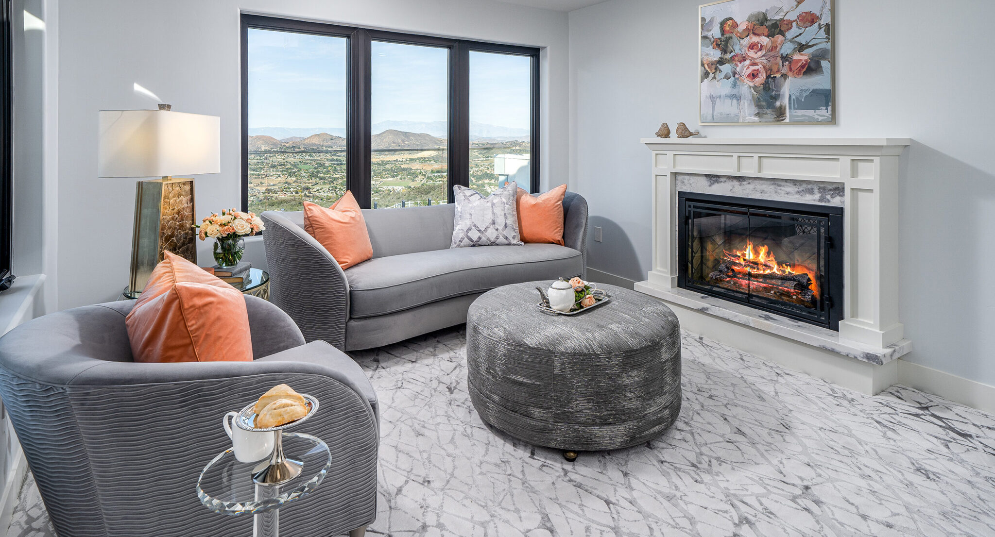
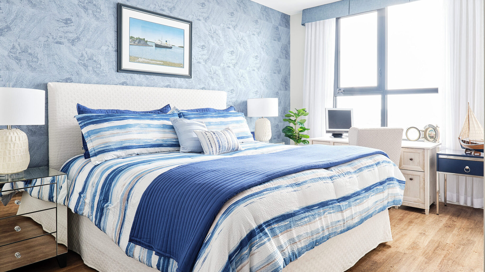
The 60:30:10 rule is the use of ratios when decorating with color in your home, it underlines the percentages for your color scheme. The usual neutral color is the more dominant color that occupies 60% of the space, the secondary color covers 30% of the space, and the accent color should not cover more than 10% of the space. This includes all of the decorative elements in the room, including drapes, rugs, furniture, wall decor, wall color, etc. The 60:30:10 rule is the perfect way to balance your colors.
Using Color
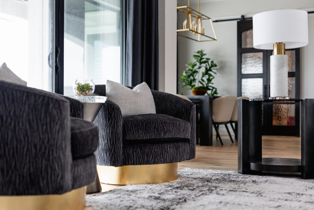
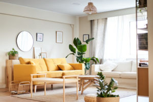
The same color can have several meanings. Red for example has several meanings such as strength, love, and power, but also war and danger. Blue is a common color used in interior design, it inspires trust, wisdom, loyalty, and truth. Purple can be associated with creativity and luxury. Different shades and different uses can create different feelings. Orange and yellow can be joyous, fresh, and energetic. Using darker shades of orange and yellow can be related to sickness, jealousy, and distrust.
Using Lighting
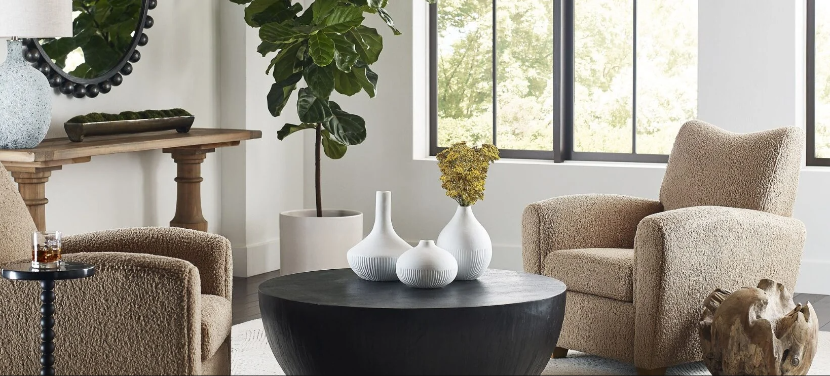
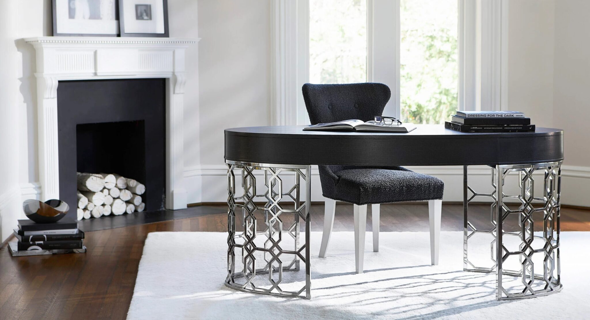
Different types of lighting can make the same shade of color look different. Not only does artificial lighting affect the way your colors look, but it also affects your mood. Color and lighting work harmoniously. Just like color impacts the mood, size, and use of the room so does lighting. Try to use natural lighting when possible by sheer drapes, not blocking windows with furniture, and use mirrors in the room to reflect light and allow light to circulate through the room. When natural light is not possible it is important to think about the amount of space in the room and the type of, ambient, accent, or task lighting you are using.
Use the 60:30:10 rule and perfect lighting to balance your color and lighting to create the perfect space!